Uncovering BindingDB's Hidden Insights
Introduction
Proteins and molecules are constantly interacting within living organisms, driving essential biological processes. By experimentally studying known interactions—and testing new ones—scientists gain deeper insights into these processes. However, the wealth of experimental data scattered across scientific journals over years, if not decades, can make it challenging to compile results on a specific interaction. Enter BindingDB, a powerful online resource that brings together data from these experiments in one place, enabling in silico analysis of protein-ligand interactions. Fascinated by the potential of this resource, our team explored the database to uncover valuable insights from this precious data collected over the years through experiments conducted across the globe. Four key questions arose, waiting for a team to cleverly use their freshly acquired skills to find an ADAnswer:
- Can we identify key mutation sites that alter binding affinity?
- How do mutations in reference-mutant protein groups affect binding affinities with specific ligands?
- Can we predict the coarse pattern of interaction of an unseen protein using its learned sequence embedding and ligand clustering?
- Can a low-dimensional space capture meaningful protein-ligand behaviors?
Our analysis is divided into two parts: the first, titled “Mutants Analysis”, addresses the first two questions, while the second part "Embedding Analysis" focuses on the remaining two.
Mutants Analysis
Protein mutations play a pivotal role in understanding various biological processes, especially in drug development. These mutations can significantly influence how a protein interacts with specific molecules, known as ligands. Accounting for these variations is essential when designing drugs that aim to be effective for a broad population. This crucial interplay between mutations and ligand binding sparked our curiosity and inspired the focus of the mutant analysis. We extracted the five “interaction pairs” with the highest number of mutants from BindingDB to display and analyse. An “interaction pair” here refers to a ligand and a group of similar proteins, i.e. a wild-type (WT) protein and its mutants. It would be too long to analyse in details every single one of those five interactions, so we have decided to focus on one that we found interesting because it includes all kinds of mutations (insertions, deletions, and substitutions). Nevertheless, all plots are available for every interaction pairs and can be displayed by selecting the corresponding dropdown option. Here is a summary of the five interaction pairs.
| Pair n° | Ligand Name | WT Protein |
|---|---|---|
| 1 | N-[7-chloro-1-[(3R)-1-[(E)-4-(dimethylamino)but-2-enoyl]azepan-3-yl]benzimidazol-2-yl]-2-methylpyridine-4-carboxamide | EGFR_HUMAN |
| 2 | (E)-N-[4-(3-chloro-4-fluoroanilino)-7-[(3S)-oxolan-3-yl]oxyquinazolin-6-yl]-4-(dimethylamino)but-2-enamide | EGFR_HUMAN |
| 3 | N-(3-chloro-4-fluorophenyl)-7-methoxy-6-(3-morpholin-4-ylpropoxy)quinazolin-4-amine | EGFR_HUMAN |
| 4 | 4-[(1R)-1-aminoethyl]-N-pyridin-4-ylcyclohexane-1-carboxamide | KAPCA_BOVIN |
| 5 | 4-methyl-5-[[(2S)-2-methyl-1,4-diazepan-1-yl]sulfonyl]isoquinoline | KAPCA_BOVIN |
We briefly explain here the notation used to describe mutations. There are three types of mutations:
- A substitution is a mutation that changes the type of amino acid at a given position. For example, T790M means that at position 790 on the target sequence, the amino acid Threonine was mutated to Methionine
- A deletion is a mutation that shortens the length of the protein. For example, [30-120] means that the protein was truncated and only the sequence from amino acid 30 to 120 remain. A deletion of a single amino acid at position 19 would be indicated by [1-18, 20-120]
- An insertion is a mutation that makes the protein longer by introducing amino acids. [1-769, ASV,770-1210] means that three amino acids were inserted between amino acid at position 769 and amino acid at position 770, respectively Alanine, Serine, and Valine
Multiple Sequence Alignment (MSA)
At first sight, identifying mutations from protein names might seem straightforward if you’re human. An example is EGFR[1-18, 20-1210, C797S], where there is a deletion at position 19 and a substitution at position 797 from Cysteine to Serine. However, inconsistent formatting, different brackets, notations, or errors (like EGFR[1-751, 75360-1210] instead of EGFR[1-751, 760-1210]) makes this task non-trivial for a computer.
To solve this, we turned directly to the protein sequences. Using pairwise alignment with the Needleman-Wunsch algorithm, we compared each mutant sequence to the reference protein. This approach allowed us to identify insertions, deletions, and substitutions, overcoming the ambiguity hidden in the names.
Once the differences were identified, we constructed a Multiple Sequence Alignment (MSA). The result is a clean and intuitive visualization: the reference sequence at the top, mutants neatly aligned below.
To make the changes stand out, we added color:
- Insertions are highlighted in green.
- Substitutions are highlighted in yellow.
- Deletions are highlighted in red.
With this alignment, variations against the reference, and patterns across mutants, become instantly visible, offering insights into how these changes might relate to functional outcomes, like shifts in IC50 values. Pick an interaction pair, scroll through the protein sequences, and you’ll see the different types of mutations neatly aligned, ready to reveal their story.
Impact of mutations on binding affinity
To visualize the impact of specific mutations on binding affinity, we decided to first use scatter plots for a given interaction pair Wild-Type protein - Ligand. To assess the impact on binding affinity we look at the log ratio of IC50 values between the WT and the mutant. IC50 is a measure that indicates how much of a given ligand is needed to inhibit, in vitro, a given biological process or biological component by 50%. This value was present in the majority of experiments included in BindingDB and this is why it was used as a measure of binding affinity in our project. Given the range of values in the dataset, using the log ratio was the best way to visualize the results that can be interpreted as such: a positive value means a decreased binding affinity and a negative value means an increased binding affinity.
Many information can be found on the plot such as the position of the mutation on the amino acid sequence (x-axis) as well as complementary information like the name of the mutant and the type of mutation that can be found by going over certain points on the plot using the user’s computer mouse. This interactive plot allows the user to zoom in certain parts of the sequence, to keep only specific mutants, and many more features that we hope the user will discover and play with.
The second plot below the one just described is very similar but is colored in a different way. Color is used in the first plot to identify all mutations that are in the same mutant, but it is used in the second plot to visualize the difference in ESM2 probability. ESM2 is a masked language model that can be used to predict the probability of having a specific amino acid at a given position on a target sequence. It is thus interesting to compare the “likelihood” of the mutated amino acid versus the WT amino acid for a given substitution. This process can not be done for deletions and insertions since ESM2 is trained specifically to predict amino acids at masked positions. Since probabilities are between 0 and 1 by definition, the difference of the mutated one minus the WT one is bound between -1 and 1. A difference of -1 indicates that ESM2 is absolutely sure that the WT amino acid needs to be at the given position for the protein and correspondingly, a difference of +1 indicates that ESM2 is very confident about placing the mutated amino acid at the given position. The two scatter plots are after another to allow a better transition between both during analysis. As for the first plot, the user can use the computer mouse to go over points on the plot to learn more about the mutation.
Several interesting insights are observable on the subplots for the Interaction pair 2 (EGFR_HUMAN). We see that the two first mutants ([1-18, 20-1210, C797S], [1-18, 20-1210, T790M, C797S]) are very similar in terms of mutations, i.e., the second mutant has one extra point mutation at position 790 (from T to M). Nevertheless, we see a big difference on the y-axis between those two mutants. We can thus understand that the mutation at position 790 results in a great reduction of the binding affinity (even in the case where binding affinity was already reduced compared to the WT-Ligand interaction). The same exact conclusion can be drawn by looking at mutants 3 and 4 ([1-18, 20-1210, T790M], [1-18, 20-1210]), mutants 8 and 9 ([L858R, C797S], [L858R, T790M, C797S]), and mutants 10 and 11 ([L858R], [T790M, L858R]) Moreover, we also notice that for the mutant with the long deletion ([668-1210,T790M,L858R]), the IC50 log ratio is exactly the same as for the mutant [T790M, L858R]. This indicates that the deletion has no direct impact on the binding affinity.
The bottom plot displays three mutations:
- mutation at position 790 from Threonine to Methionine: the probability difference is around -0.2 meaning Threonine is more probable than Methionine according to ESM2. The difference being small, it is hard to draw any conclusions but the negative sign still indicates a similar idea as our previous plot in which we said that T790M was non-beneficial
- mutation at position 797 from Cysteine to Serine: the probability difference is around +0.3 indicating that Serine is more likely to be at that position compared to Cysteine according to ESM2
- mutation at position 858 from Leucine to Arginine: the probability difference is around -0.8 which strongly indicates that Leucine is more likely to be at that position compared to Arginine. This is partially in contradiction with our previous analysis that stated that this mutation was beneficial
Overall, as we will see in our other analysis, binding affinity is not properly captured by ESM2 and these results should be taken with a grain of salt.
Impact of ligands on binding affinity
So far, we looked at a given interaction pair Ligand - WT protein and explored how mutations in the WT protein affect binding affinity. Interestingly, among the five pairs we selected, there are only two WT proteins: EGFR_HUMAN and KAPCA_BOVIN. This opens up an intriguing opportunity to flip the perspective and examine how different ligands impact binding affinity for a given pair WT protein - Mutant. We collected data for the five interaction pairs, paving the way for a fresh angle of analysis.
For better visualization, we produced two bar plots—one for each WT protein—showcasing how different ligands influence binding affinity across their mutant variants. The bar plots show again the log ratio of IC50 values and each group of bars represents this value for a given WT/mutant pair. For a WT-Mutant pair, the colors of the bars identify the interacting ligand.
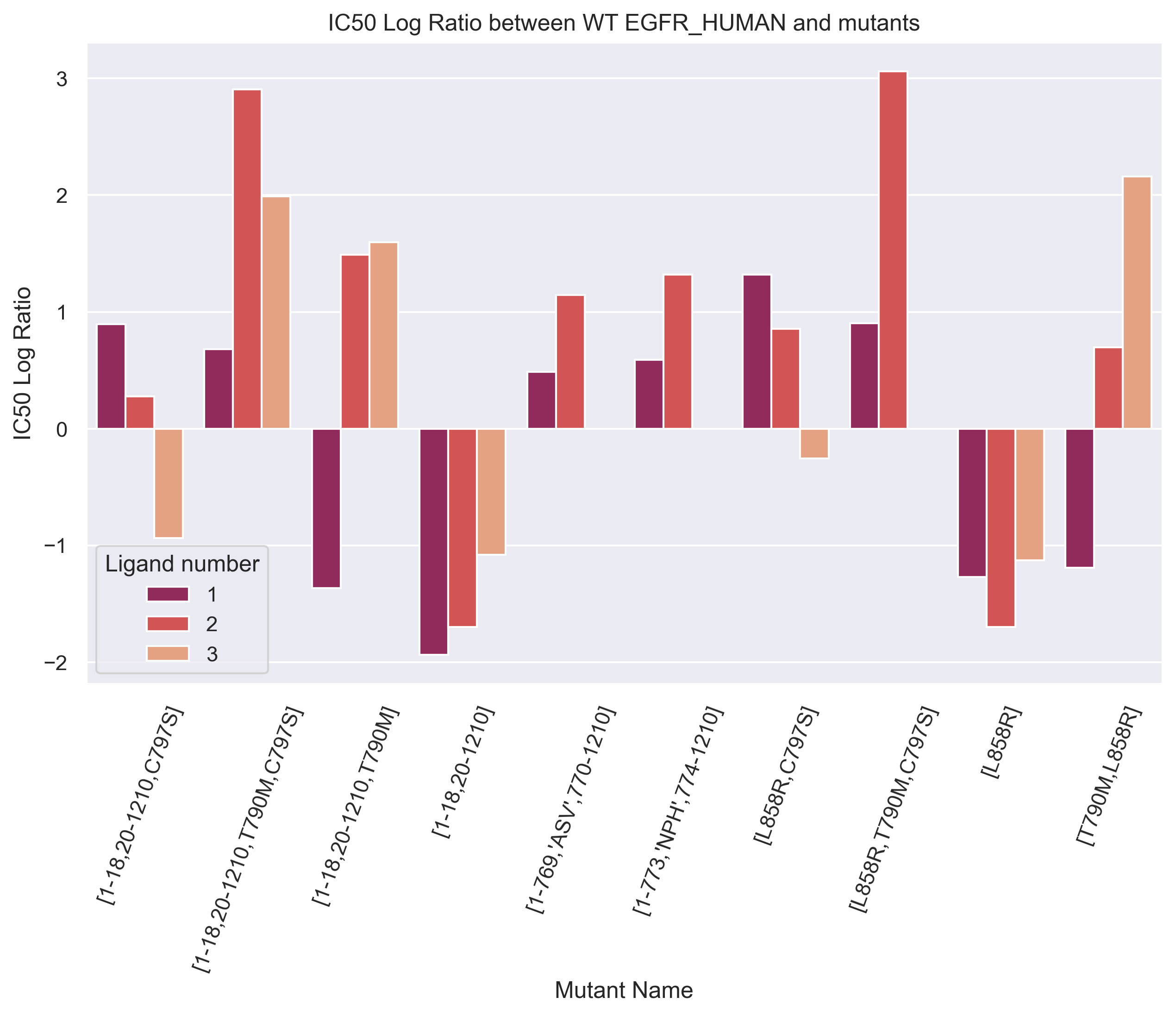
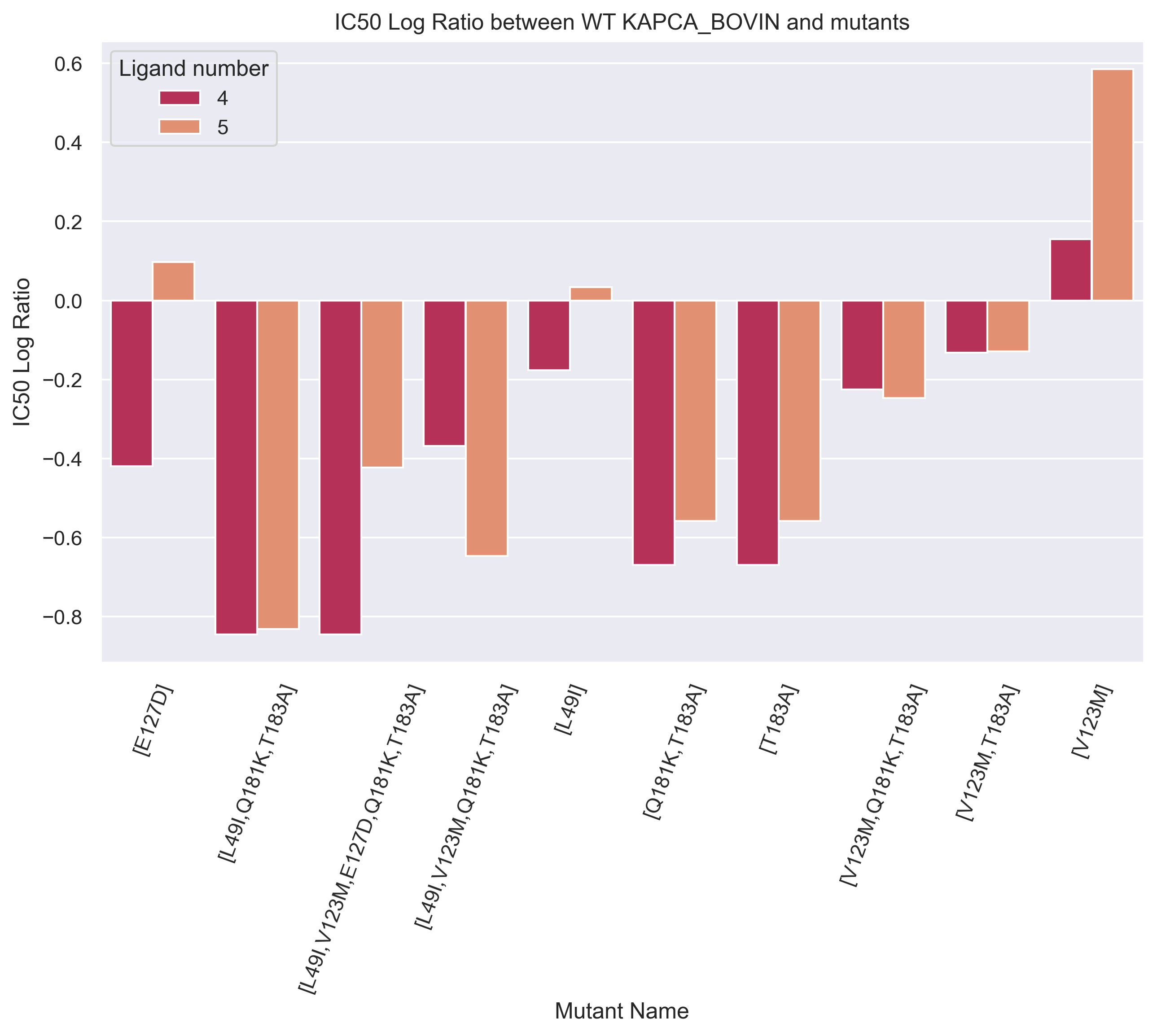
The goal was to see if any clear trends arose from the plot. Logically, this is not the case, since binding affinity depends on many components and not only the properties of the ligand.
Still, for the two last mutants shown on the left plot we observe two very different patterns even though there is only one different mutation. We can thus make multiple hypothesis such as:
- position 790 is not important or not involved in the binding of the protein EGFR (and its mutants) with ligand 1
- the mutation T790M reduces the binding affinity with ligand 2 and ligand 3
Similarly, for the two last mutants shown on the right plot we see a big difference on the log ratio even though there is only one different mutation. We can thus make multiple hypothesis such as:
- position 183 is important or involved in the binding of the protein KAPCA (and its mutants) with both ligand 4 and 5
- the mutation T183A reduces the binding affinity with ligand 4 and 5
3D visualizations of proteins
Enough of long protein names and numbers—we’ve talked plenty about how changes in protein structure affect binding affinity. Now, it’s time to see the proteins themselves in action! The next interactive plots let you explore the actual 3D structures of two proteins and some of their mutants. For the mutants, grey parts represent deletions, and green spheres represent substitutions. Interestingly, we see that all the mutations are located in a similar subspace for the mutant KAPCA [L49I, V123M, E127D, Q181K, T183A], and a further analysis could look at the importance of this part of the structure for binding affinity.
3D visualizations of ligands
For completeness, we have decided to also include the 3D visualization of the ligands. We hinted at the importance of the ligand in binding affinity even though we mostly focused on the importance of the protein, and another interesting project (maybe for next year ADA students) would be to investigate the structure of ligands in more details.
Final words on Mutant Analysis
We have seen that we were able to identify key mutations sites for binding affinity and find examples of interactions where the ligand had an important impact on binding affinity. A next project could be to analyse the properties of the ligands and the mutated amino acids to try to find possible explanations for this impact. As mentioned earlier, looking at the 3D structure of the interaction could also validate some of the results we have found with our analysis.
Embeddings Analysis
While transformers were initially developed for natural language processing, their application in bioinformatics, particularly for analyzing molecular properties based on sequence data, has become increasingly significant. These models have become the standard for representation learning—the process of automatically learning useful features from raw data to improve task performance—owing to their exceptional ability to transfer knowledge across a wide range of downstream tasks. In protein analysis, models like ESM-2 (Evolutionary Scale Modeling) have shown promise in predicting protein structure, stability, and function by leveraging sequence information. Similarly, for ligands, transformer-based models like ChemBERTa have been used to predict molecular properties, including binding affinity, by encoding the sequence of atoms and bonds. These models learn key features within sequences, enabling their use in downstream tasks such as ligand-protein binding prediction and drug discovery, where understanding the relationship between molecular structure and biological activity is crucial (PLAPT , DTI-LM).
Given this context, there was a true motivation to investigate whether transformer-generated embeddings of proteins and ligands could already capture binding affinity information. This approach would offer deeper insight into the features learned by transformers. The hypothesis is that if proteins and ligands form clusters within their respective embedding spaces, with similar proteins clustering with similar ligands, then these proteins would likely bind to corresponding families of ligands, suggesting that affinity relationships may be encoded in the embeddings rather than pinpointing a single best ligand.
First insights
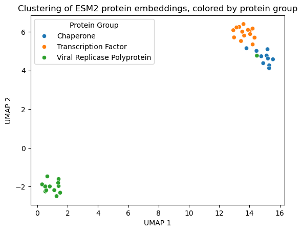
To test this hypothesis, proteins were selected from the BindingDB dataset using the criteria that at least 10 ligands had been tested to ensure sufficient data for ligand matching. For each protein, the ligand with the lowest IC50 value (meaning higher binding affinity) was selected to create high-affinity protein-ligand pairs. Due to computational constraints, a subset of these proteins was embedded using ESM-2 in this preliminary stage. The initial visualization of these embeddings revealed interesting clustering based on protein families, suggesting that ESM-2 captures family-related information effectively.
Next, ligands were embedded using the ChemBERTa transformer. To group ligands, two approaches were considered: using ligand taxonomy or applying unsupervised clustering techniques (e.g., k-Means, DBSCAN). Due to time constraints, manual taxonomy was not feasible, and automatic taxonomy via Classyfire was unavailable due to API issues. As a result, unsupervised clustering was pursued. The embeddings were projected into a lower-dimensional space, and the clusters were analyzed for biological relevance. The clustering revealed eight spherical clusters, with five major ones and smaller clusters on the periphery. k-Means clustering appeared to be a suitable method for classification (left subplot below).
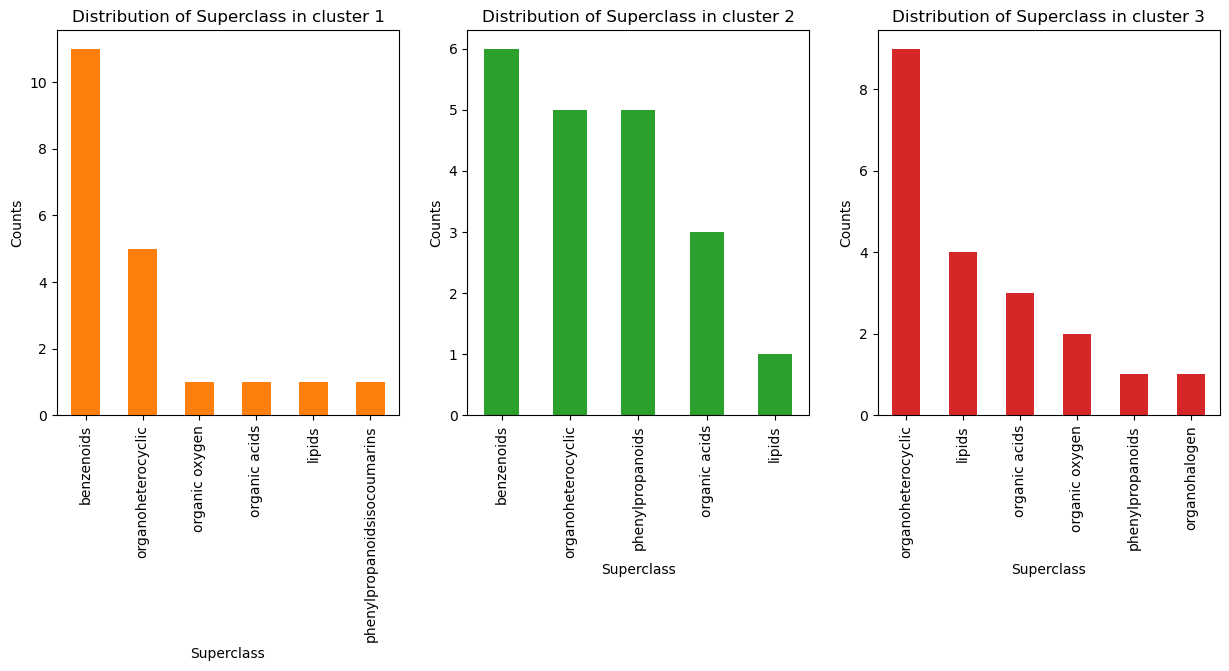
To further explore the clusters, 20 ligands were randomly sampled from three classes and manually input into Classyfire for taxonomy classification (right subplot above). A lot of overlap can be seen between the top subclasses in the three clusters and we thus decided to not pursue this route.
Deeper analysis
With an initial understanding of the biological relevance of the embeddings, all selected proteins were embedded and labeled by their corresponding matched ligands (right subplot below). However, the resulting embeddings appeared sparse and unstructured when visualized using UMAP, suggesting that the dimensionality reduction technique failed to capture underlying patterns. As a result, classification performance on these embeddings was predicted to be low. Indeed, when tested with four classifiers—kNN, SVM, logistic regression, and MLP—using grid search for hyperparameter optimization and cross-validation, the balanced accuracy never exceeded 0.12, indicating poor performance. Given the sparsity observed in the UMAP visualizations, we attempted to classify directly from the 320-dimensional ESM-2 embeddings. However, the curse of dimensionality hindered the performance of kNN, and all models failed to achieve balanced accuracy above 0.12. These results suggest that the ESM-2 embeddings do not directly encode binding information related to ligand families.
Towards better interpretability of protein and ligand language models
The strikingly low performance of powerful machine learning models in predicting protein-ligand interactions from ESM2 and ChemBERTa embeddings suggests that those language models, although encoding key features of proteins and ligands (e.g., ligand brain penetrability, toxicity, protein function) do not capture the information amino-acid and SMILES sequences contain about interaction. Graphs offer a promising framework to study interactions between different entities. In the following, we will leverage this approach to gain understanding on the information that is encoded in the protein and ligand latent spaces ESM2 and ChemBERTa provide.
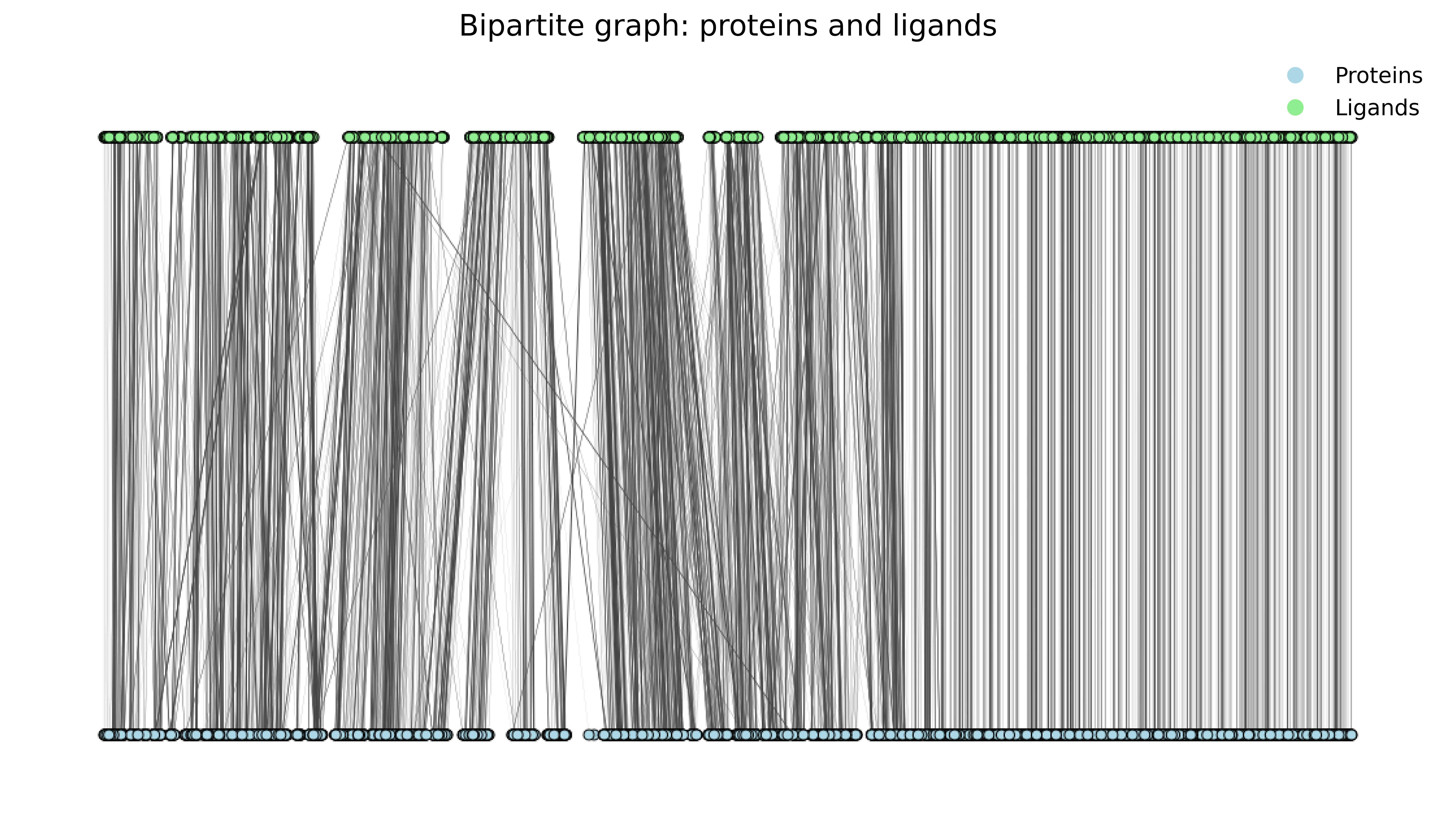
Constructing a protein-ligand bipartite graph with IC50 as an inverse weight function
Interactions between proteins and ligands can be represented using a bipartite graph. Having chosen IC50 as our proxy for drug-target affinity, we defined the interaction weights of this graph as a monotonic, decreasing and positive function of IC50, additionally introducing a logarithm so as to account for the large variability in IC50 in the dataset, ranging from near-\(0\) to \(10^{13}\) concentration values.
In the previous section, we restricted our analysis to proteins presenting more than 10 interactions in the dataset, and selected only the best-binding ligands. Yet, the non-optimal interactions between ligands and proteins still provide important information on their respective interaction profiles. Two ligands binding very poorly to a common protein might share similarity in structure, properties, etc. That we why we reintroduce the complete preprocessed dataset in the following, and thereafter extract the subgraph that retains only the protein-ligand interactions studied in the previous section.
Extracting interaction profile similarities through bipartite graph projection
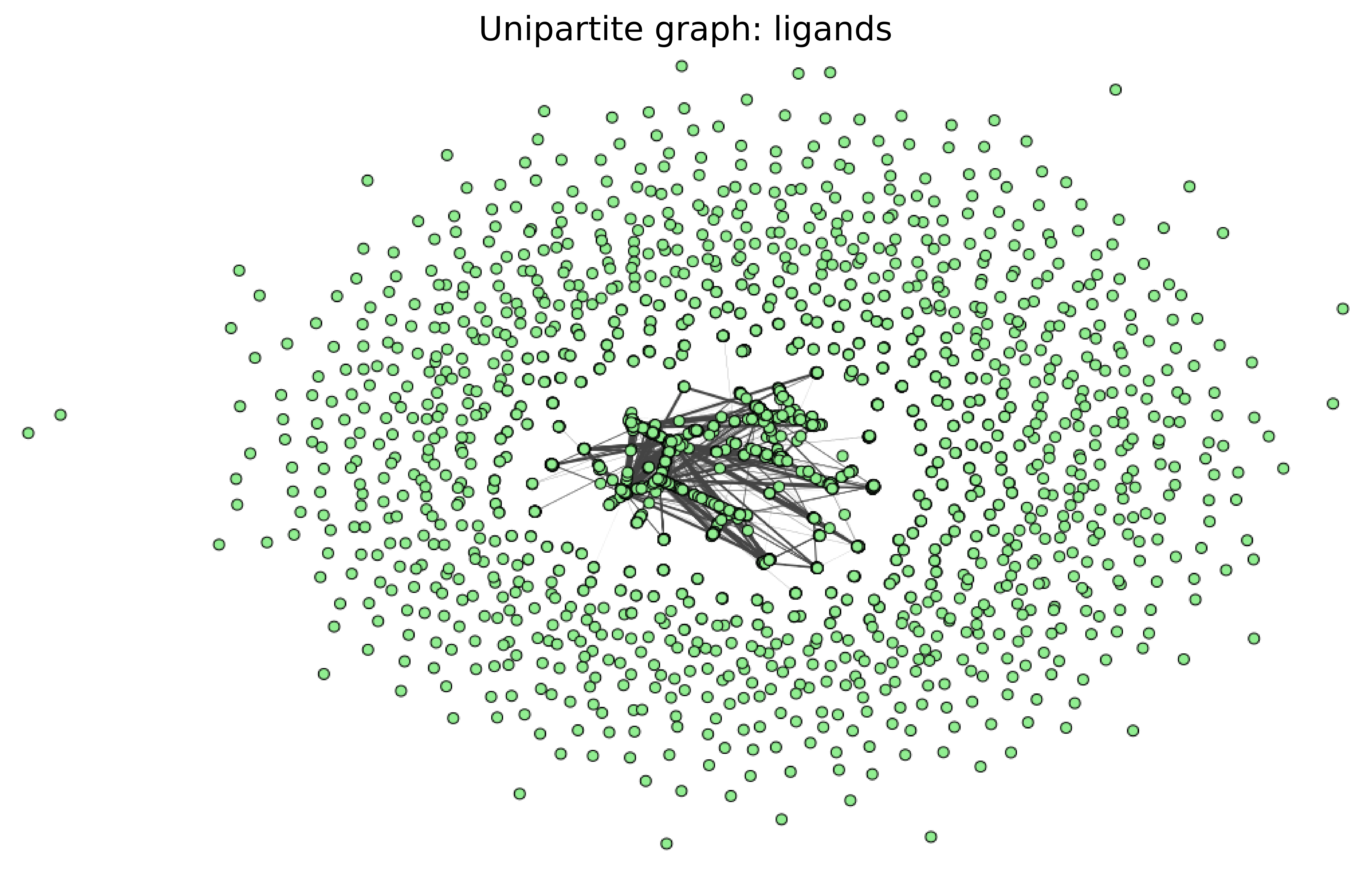
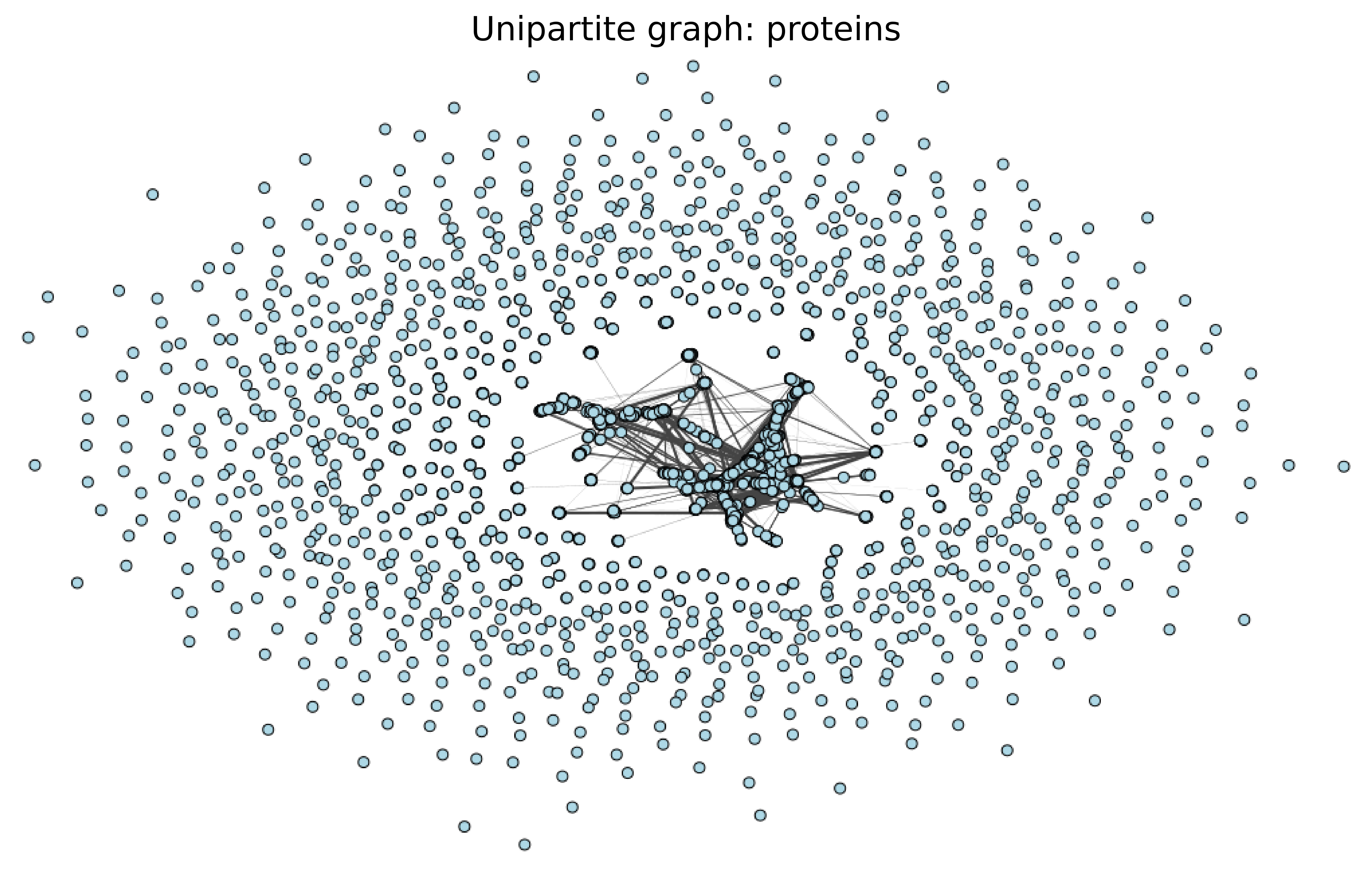
A bipartite graph can be projected onto a unipartite graph by connecting nodes that share a common neighbor, thereby representing only one type of entity instead of two. We adopted this strategy to compute the similarity of interaction profiles between proteins and between ligands respectively. Indeed, in a unipartite graph, the strength of the connection between two nodes reflects not only the number of common neighbors they share but also the strength of their interactions with those neighbors, i.e. how small is the IC50. Hence, if two proteins (resp. ligands) share a strong connection in the unipartite graph, it suggests that they have similar interaction profiles with ligands (resp. proteins). The connection weight therefore provides us with a measure of interaction profile similarity.
Correlating interaction profile similarity in protein and ligand unipartite graphs with their respective ESM2 and ChemBERTa representations
We can use this similarity measure in interaction profiles to evaluate whether ChemBERTa and ESM2 embeddings capture this characteristic of ligands and proteins. Instead of expecting a perfect matching between unipartite weights and network representation similarities, we aim to identify an association.
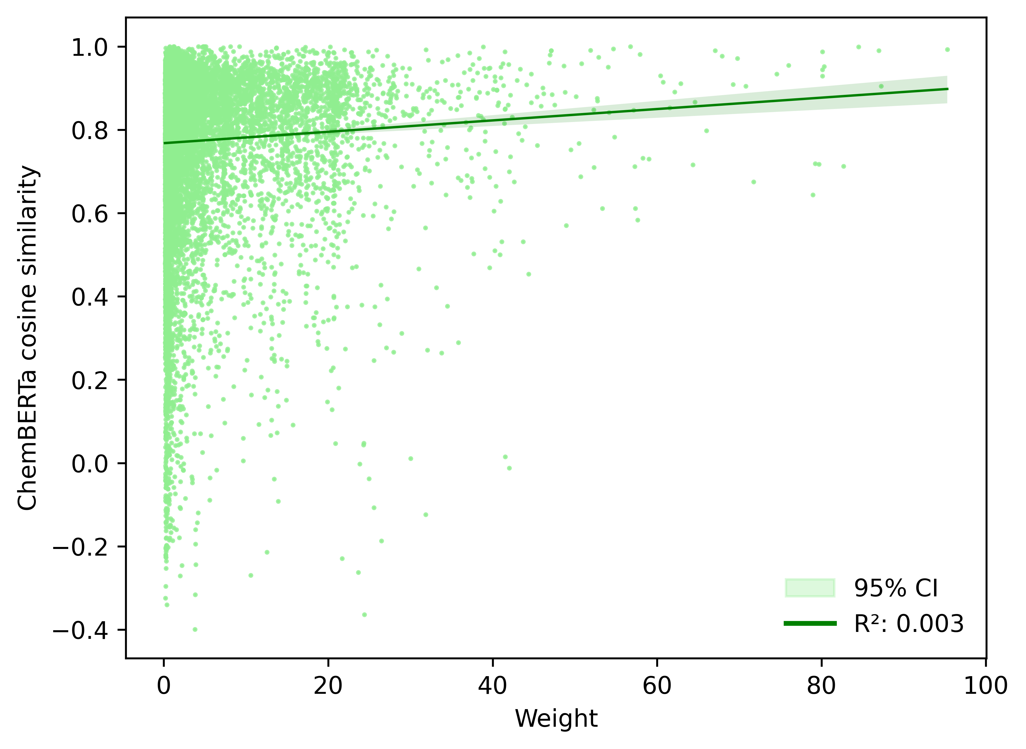
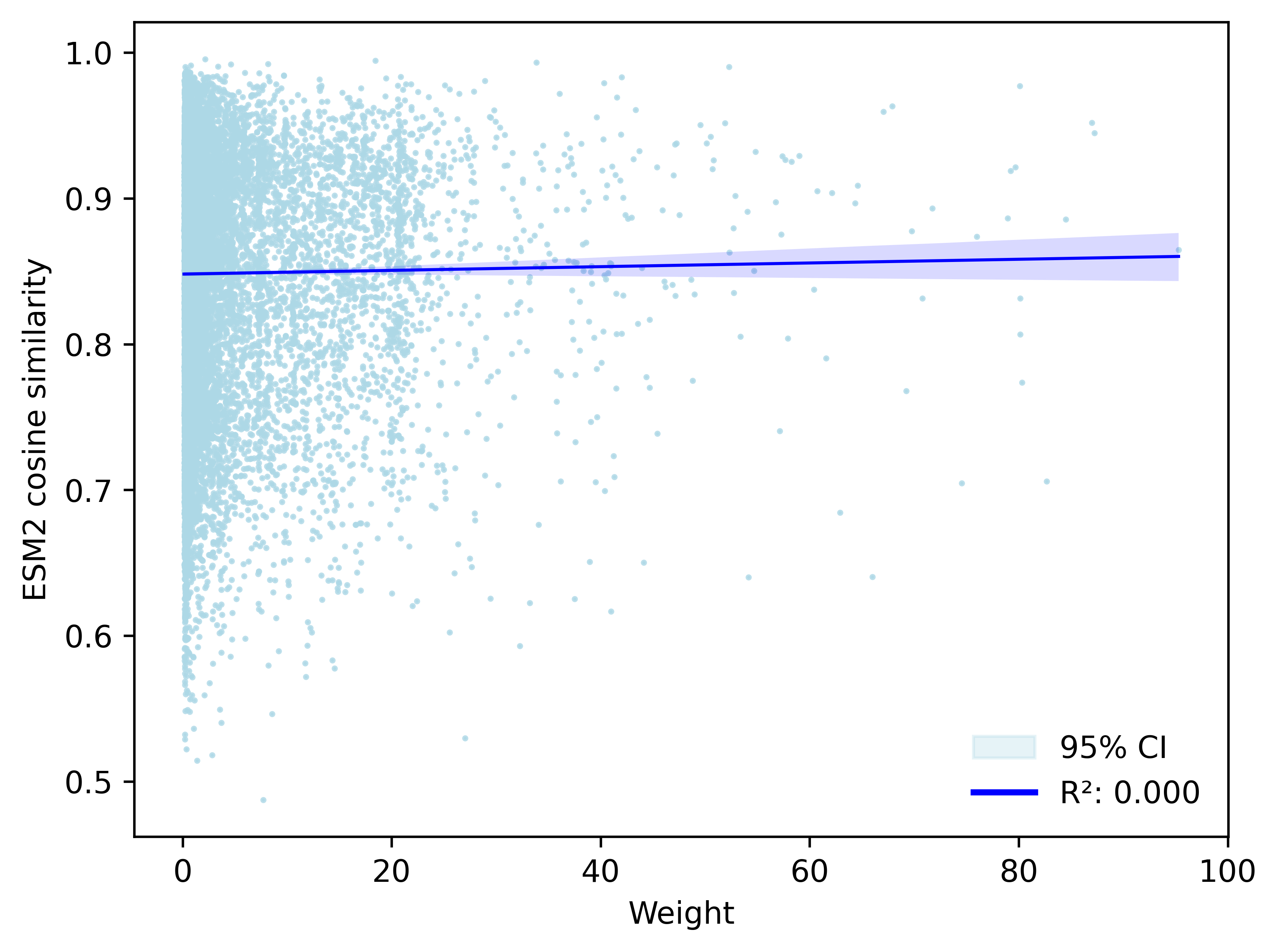
While we should not place excessive emphasis on the exact values of the weights—given that they were manually defined using the IC50 to interaction strength mapping \( \frac{1}{\log(IC50 + 1.05)} \) ,we would still expect to observe a consistent relationship between the interaction weight and the cosine similarity of the embeddings, provided the embeddings capture information about the interaction profiles. Yet, we clearly see that the cosine similarity of ChemBERTa and ESM2 embeddings is not a monotonic function of the weight, although it is increasing together with it.
Those results suggest that EMS2 and ChemBERTa protein and ligand representations do actually not capture the features needed to extract their interaction profiles, in turn potentially explaining the very poor performance of the predictive models we trained in the last section.
Further perspectives into interaction-profile-aware clustering of ligands and proteins
Conducting community analysis on protein and ligand unipartite graphs is a promising technique for identifying clusters that reflect specific interaction profiles. These clusters, unlike those obtained by clustering the low-dimensional projection of ChemBERTa and ESM2 embeddings, could serve as a foundation for predicting classes of potentially high-affinity ligands to a given protein, fastening the process of in vitro selection of target-specific ligands.